LA METRO
Revamping the LA Metro app for maximum usability!
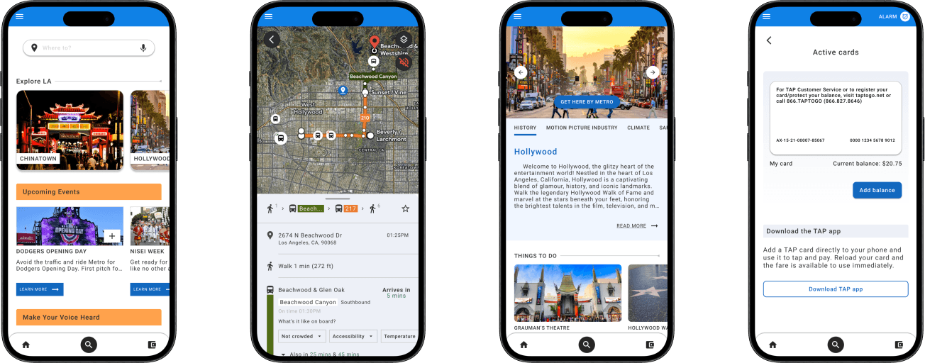
Timeline: 2 Months
Role: Sole UX/UI Designer
Tools: Figma, Figma, Maze
Context
Los Angeles is a massive city, with a population of almost 4 million people. There are various subway systems, light rail and buses that service it, and an estimated 900,000~ people use the LA Metro system on any given weekday to traverse the city, and yet the LA Metro app is severely lacking in basic features that would vastly improve the overall experience. Additionally, the LA Metro app has been fragmented into two different apps - the LA Metro app proper, which appears to be completely dead in the water, and the LA Metro tap app, which one can use in order to tap their phone and pay fares. The goal was to combine these apps into one, purposeful and functional app, as well as add additional features which are crucial for the everyday user of the system. This change will make the LA Metro app a MUST for tourists and daily commuters alike.
Problem
The LA Metro app lacks basic and essential features. There is a sister app, TAP LA - this app has a route planner but lacks realtime GPS/map functionality. These two apps represent different portions of the Metro LA website, but should realistically merge into one.
User Research
As a long time rider of the LA Metro system, I knew first-hand the realities of trying to navigate an underfunded, bloated system. Before I even began my user interviews, I knew I had to begin at the source - the LA Metro apps and website. I created a Heuristic Evaluation for both apps, as well as dove deep into the wealth of publicly available information on the website.
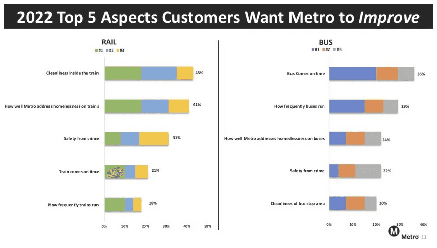
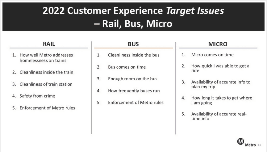
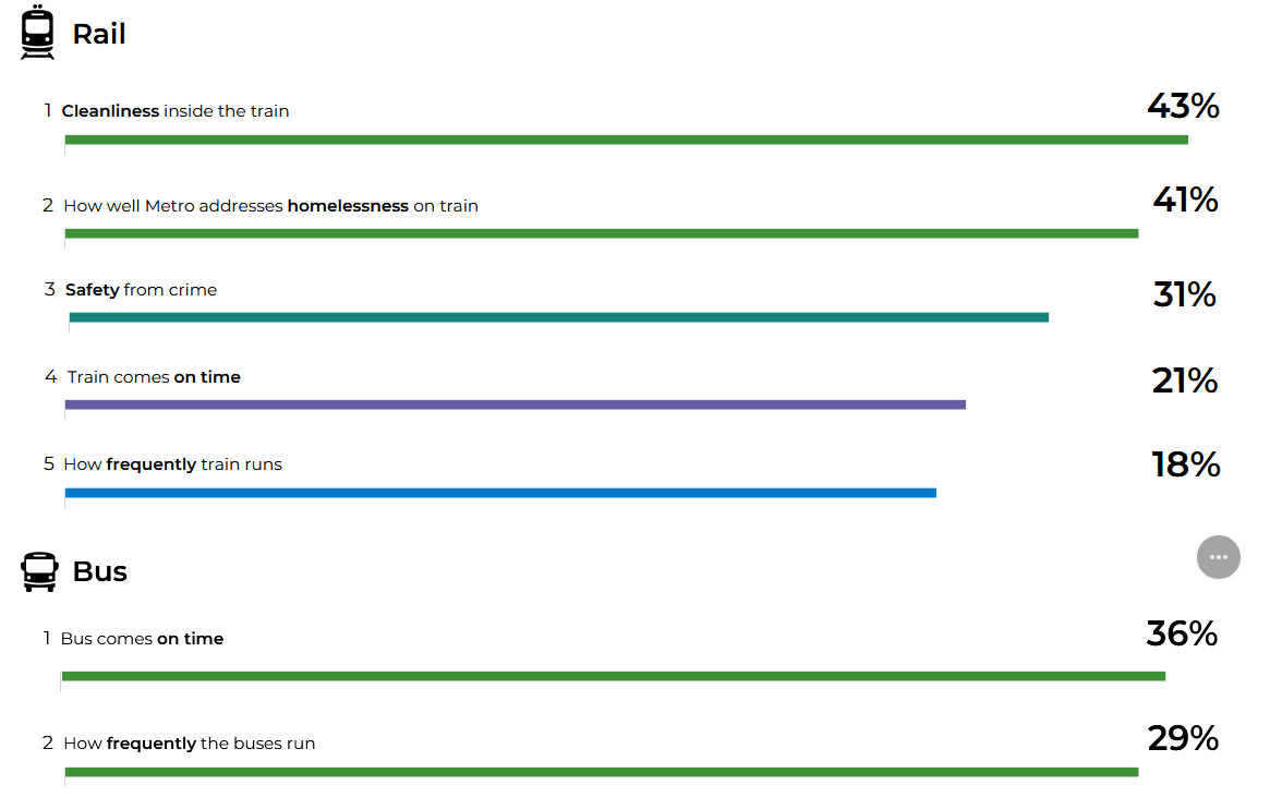
Then after diving head first into Metro’s plethora of publicly available data, I proceeded to my users interviews. I found out key points that I knew would help shape the goals of the project.
● All interviewees reported issues with timing of busses and trains (lack of live GPS,
unreliable timetables)
● All interviews reported having experienced feeling unsafe on the train and bus
● All interviewees relied on Google/Apple maps more than the Metro app (either didn't
know about the app or found it to lack features that would warrant adoption)
● Reasons for use of Metro differed among each participant
Ideation
When life gives you lemons, make lemonade!
With very little to go off of from the official apps, I looked around at various other apps, and did a Competitor Analysis. After completing my analysis, I brainstormed ideas in order to best suit the everyday user which led me to some key questions...


User Flows
Identifying and perfecting the user experience
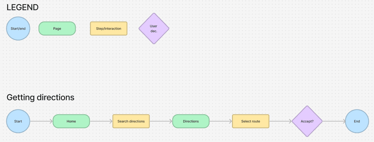
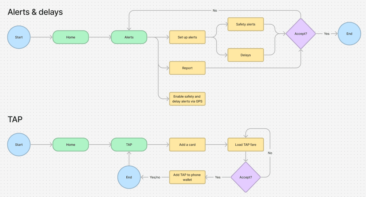
After conducting my essential user research, I created user flows for an MVP experience. These user flows would guide the user through a typical experience for the average user, to maximize utility and functionality.
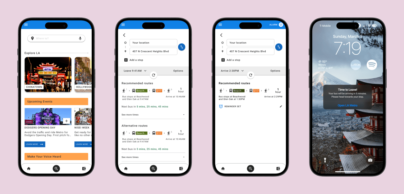
Input destination and set a reminder
Primary function of app - search for a destination, get directions. Additional task - set a reminder for departure.
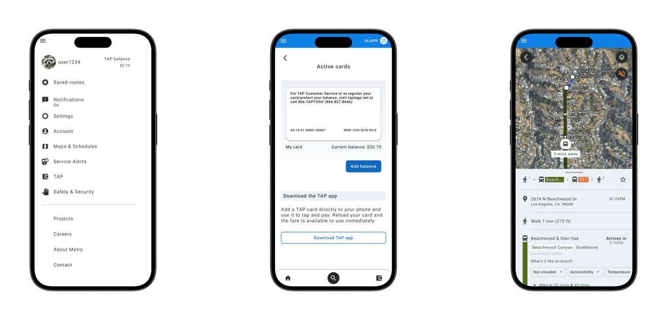
Receiving alerts, etc.
Receive alerts, see GPS of bus, view neighborhood information, report safety concerns, etc.
Add balance to TAP card
Add a balance to TAP card to be able to pay for fares.
Lo-Fi Solution/Wireframing
A cure for the root of traveler’s concerns
I knew there were key features that were absolutely necessary for an app that serviced daily metro riders, however, I wanted to do more. In Los Angeles, due to congestion, car traffic and under utilization of the Los Angeles sprawl, there is a growing push for better urban planning, including but not limited to being a less car-centric city. Increasing dense, bikeable/walkable urban areas, creating better zoning laws for multi-use apartment complexes/high rises, etc. No matter how may more traffic lanes are added, it seems to do nothing to alleviate traffic and citizens' growing dissatisfaction with sitting around in endless traffic jams. Part of the cure for this is to add more public transportation, e.g. busses and trains. There is currently a decent infrastructure in place (however, like all things, could always be better) - however , the utility of of live, reliable information for this service is greatly lacking with no apparent good reason. It appears that Los Angeles, despite having massive coffers and funds to fund such things, has left the development and availability of such information to existing app platforms such as Google Maps and Apple Maps, as well as other third party apps.
This app combines the functionality of something like Google Maps (live GPS tracking of busses, crowd funded information such as availability of seats, how crowded the bus is, etc.) and adds even MORE information, as well as utility such as safety tools (alerts, reporting for crime, etc... think a cross-over between Citizen [sans fear mongering] and Google Maps), as well as information about neighborhoods (places to eat, points of interest, etc.) to let riders learn more about surrounding areas in their own backyards.
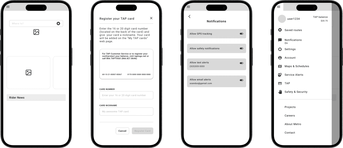
Lo-Fi snapshot
Hi-Fi Frames & Prototype
The Lo-Fi screens were pretty rough, and I did a handful of user flows that didn’t end up in the final design as it seemed not within the scope of the project, or not as important as other features. However, I began iterating upon what I had after my lo-fi testing, and wanted to bring to life an app that felt like it had life to it, just like the city it was serving.
Usability Testing and Iterating
I conducted an unmoderated usability test with 12 Metro riders via Maze. Although I received some great feedback and praise, I wasn't entirely happy with the test results, largely due to my prototyping and task flows which were slightly convoluted - however, I received great feedback for iteration, and I was also happy that the overall idea of what I was going for and design choices largely resonated with testers, just that the execution needed some tweaking, rather than the idea itself needing complete overhauling.
Final Thoughts and Moving Forward
Going back to the drawing board
I was aiming very high for this project - I think I had a good idea that was bogged down by a lot of different solutions but not enough time for execution, or not enough time to flesh out the finer points. I definitely believe it’s on the right track, however could use 1 or two more key-user flows to emphasize the utility of the app, such as further emphasizing the neighborhood and safety features, as well as things such as adding events to the calendar, etc.
Next steps
Overhauling the basic design of the app, and making a fully working prototype. Exploring key features of the app further, such as the safety aspect (alerts, feed, process of creating an alert, etc.), neighborhood exploration and how can that more naturally be further integrated into the app.
